


I used Claude to build a portfolio allocation tool for my investment portfolio.
The tool itself was simple to build. AI excels at running complicated analyses with speed.
The input assumptions for the analysis were much harder to pin down. They are critical for getting an output that is meaningful and usable. Garbage in, garbage out. Claude confidently stated wrong assumptions and changed its answer every time I questioned it.
Still, I found the analysis useful. It helped me think through how I manage risk in my portfolio. It reminded me why it’s important to focus on risk-adjusted returns rather than highest raw returns.
How to build it
I started by uploading a spreadsheet that contained my current portfolio holdings.
I prompted Claude to categorize the holdings into specific asset classes. Differentiate between treasury bonds, corporate bond, and securitized products, rather than combining all types of fixed income instruments.
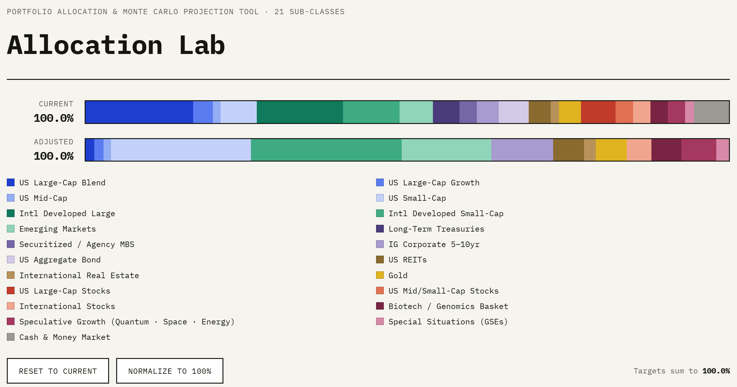
I prompted Claude to create a tool with adjustable toggles. Each toggle represents an asset class’s percentage of the total. Users can adjust these percentages in either direction using manual controls. The tool applies assumptions for the asset classes’ expected returns and volatility.
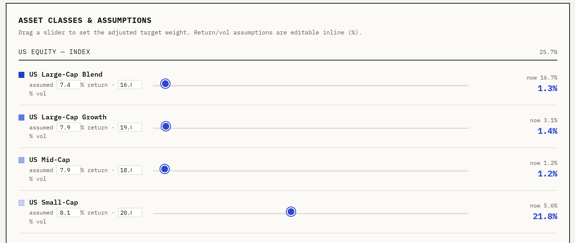
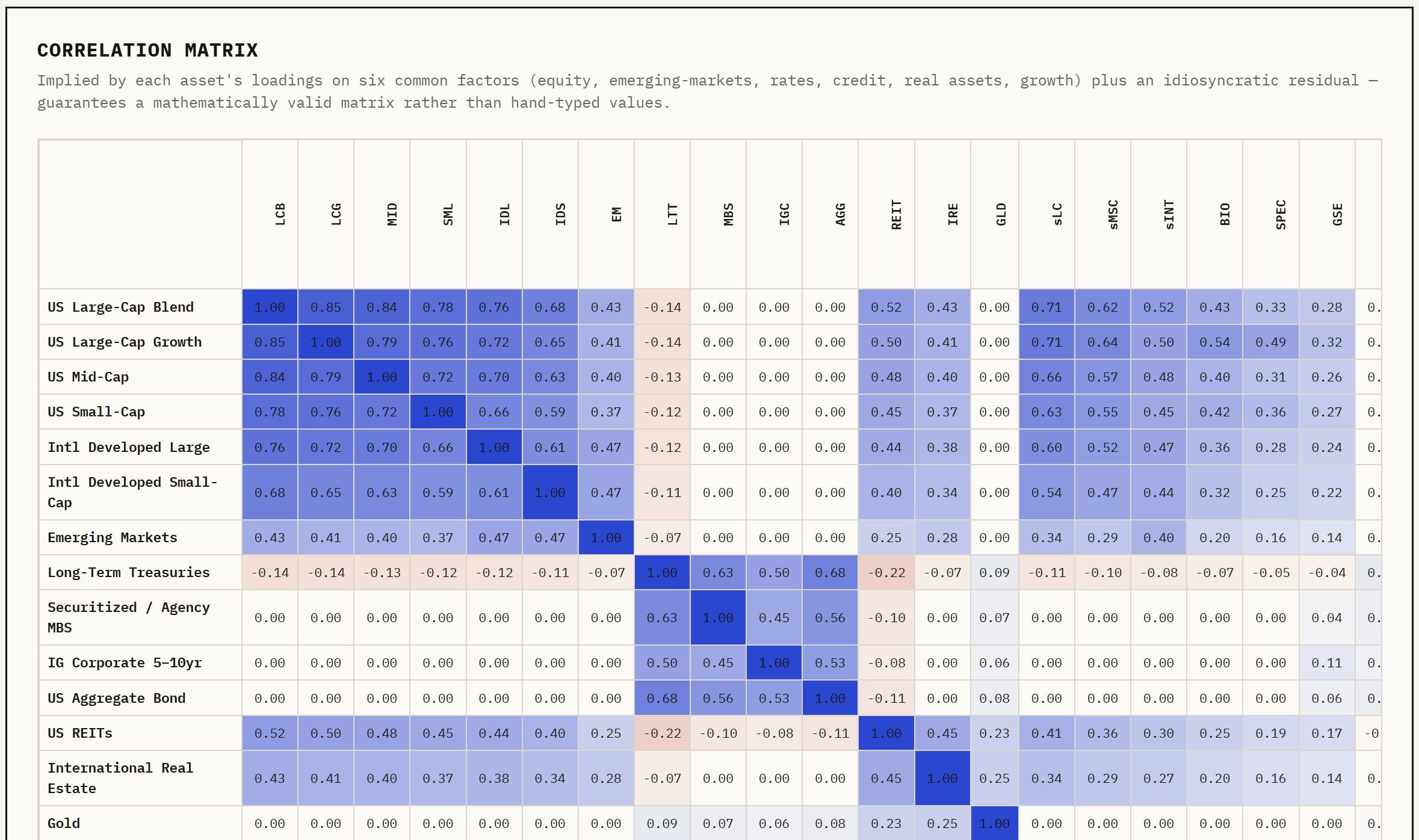
The tool will re-run the analysis based on the adjusted allocations. It will then show the expected returns and volatility of the total portfolio. The tool uses a Monte Carlo-like simulation. It projects thousands of possible outcomes. The market is unpredictable. A Monte Carlo analysis aims to model the range of potential outcomes.
It also has a field where users can enter how much new capital they will add to the portfolio annually.
The output included a graph. It showed how the portfolio would grow over 10, 20, and 30 years. All modeled scenarios formed the basis for this. It showed a side-by-side comparison of the expected returns. One was for my current portfolio, and the other was for the new portfolio with my changes.
The shaded blue range illustrates the 90th to the 10th percentile outcomes. The dark blue line indicates which outcome is the most likely. Compare this the gray line, which indicates the trajectory of the current portfolio without modeled changes.
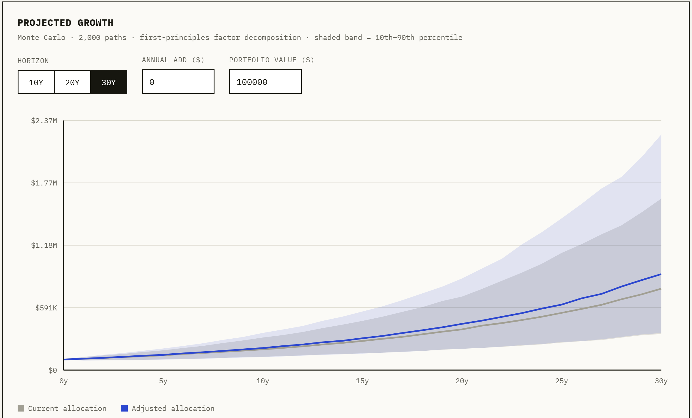
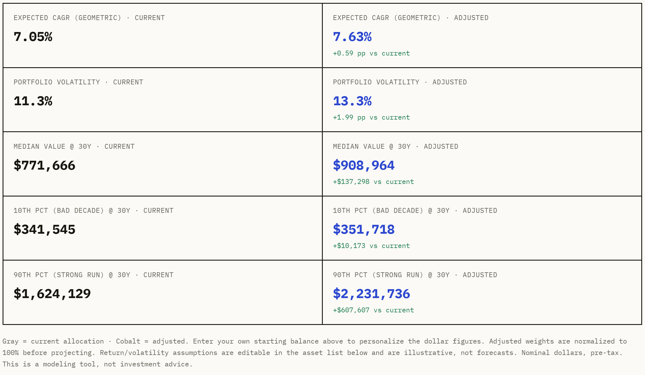
The output showed the portfolio’s geometric annual growth rate and volatility. From those, it projected what the portfolio would grow to in a bad market, what it could grow to in a good market, and what it’s most likely growth would be. Each shown for both the current and adjusted portfolio.
The assumptions are critical
To run this analysis, Claude had to estimate the expected returns and volatility for each asset class. This is the part that is a bit subjective. Every time I asked it to verify these assumptions, it changed them. At one point, it sourced estimates from Charles Schwab. I asked it to perform its own analysis and produce reasonable assumptions. It kept changing its mind. Assumptions about the future are, by definition, unknowable. Yet, the output that comes out of this analysis is only as solid as the inputs that go into it.
In the last decade, U.S. stocks did much better. In contrast, international and emerging markets lagged behind. The U.S. is a more mature market, and it is generally expected to have a slower growth rate. The reason the last decade was so unusual is that a small group of Tech/AI stocks carried the U.S. market. The “Magnificent Seven” accounted for roughly 42% of the S&P 500’s total return in 2025 alone. Most companies thriving from the AI boom since ChatGPT’s 2022 launch are based in the U.S.
Many forecasters expect slower growth in U.S. markets over the next decade. This is because valuations are much higher than usual. (Of course, back in 2017, Vanguard predicted a decade of low growth, and we know how wrong that was.) The gap between U.S. valuations and those in international or emerging markets is large. It’s the largest it has ever been. Which geography is best positioned to gain from the next decade of AI-driven growth? There is no clear answer. This is another key assumption in the model that is almost impossible to determine.
Here are sources to inform model assumptions:
Vanguard Capital Market Model forecasts (published June 2026)
JPMorgan Long-Term Capital Market Assumptions (published Sept 2025)
GMO 7-Year Asset Class Forecast (published June 2026)
BlackRock Capital Market Assumptions
Geometric returns and volatility
Once I had the tool set up, I could do the more interesting analysis. I asked Claude to reverse-engineer the construction of the highest growth portfolio. Claude ran the calculations and showed me the optimal way to achieve high growth. One change it recommended for my portfolio was reducing volatility.
Studies say that women tend to make better investors than men. Women are generally more risk-averse. Over time, this tends to result in higher returns. Men often look for higher volatility in their investment strategies. They trade more often and tend to hold on to losses longer. The original study found that men trade 45% more than women. Women increase their returns by trading infrequently and cutting losses sooner.
The Portfolio Allocation Lab modeled this. Increasing volatility levels raise the best-case scenario while also lowering the worst-case scenario. The most likely scenario often becomes worse. The potential deeper losses pull down the median outcome.
This is a good spot to explain a key financial idea. Let’s look at the difference between arithmetic returns and geometric returns.
Arithmetic returns are simple averages, while geometric returns account for compounding over time. The geometric return is the more accurate calculation.
Imagine playing a game of coin flipping. The probability each time is 50%. Start with $100. In year 1, you win the coin flip and gain 50%. You now have $150. In year 2, you lose the coin flip and lose 50%. You may think “+50% and -50% cancel out, so I’m back to $100.” This is incorrect. Losing 50% of $150 sets you back to $75. Even though your two yearly returns “average” to zero, you lost 25% of your initial $100.
Two portfolios can have the exact same average annual return. However, they can end up in very different places due to how bumpy the ride was. The volatility and fluctuations in value make a big difference in the final outcome.
Steady: +5%, then +5%. $100 → $105 → $110.25. Total gain: +10.25%
Bumpy: +30%, then −20%. Average of +30 and −20 is still +5%. But: $100 → $130 → $104. Total gain: +4%
Concentration vs. diversification
The Portfolio Allocation Lab hinges on diversification. My personal portfolio has several single-stock bets (because I like picking stocks, sue me).
Many investors will attribute large investment fortunes to concentration. In other words, going all in on one bet. Concentration widens the range of outcomes. A few end up with massive fortunes, and they are outliers. Most end up much worse off, and their stories are rarely told.
In 2018, Hendrik Bessembinder studied all U.S. stocks back to 1926. Only 4% of stocks drove the market’s outperformance of Treasury bills. The majority (51.6%) of stocks lost money. Concentration bets you can pick that 4%.
A concentrated bet only reliably pays off when you know something the market doesn’t. Without a real edge, it’s just uncompensated volatility.
Investor’s edge
When I pushed Claude to find higher growth, it directed me to leverage.
Cheap leverage is hard for individuals to find. Schwab margin: ~10%. Interactive Brokers: ~5%. Both risk margin calls, and most other credit lines bar you from investing the proceeds.
One option it directed me to is ETFs with leverage built in via Treasury futures. $1 invested buys $1 of global equities plus $1 of Treasury exposure, at cheaper-than-retail financing. Launched only in 2023, so data is thin.
Warren Buffett is basically a case study in this. AQR's "Buffett's Alpha" paper found Berkshire's edge wasn't really concentration. It was ~1.6x leverage, financed through insurance float.
Try it yourself
If you would like to complete this portfolio exercise on your own, here is the prompt I used to build the tool and run the analysis.
“Review the attached positions in the [Portfolio Positions] document. Create a tool that models future returns based on allocations across asset classes. Organize the attached holdings into each category. Be precise on the categories (not simply “fixed income”, but differentiate between treasuries, corporate bonds, securitized). For each asset class, define return and volatility assumptions. Build a correlation matrix between the asset classes. The simulation should account for how they move together. Build a toggle for each asset class where I can adjust the allocations up or down. Run a monte carlo-like simulation. Create a graph that displays the 10-year, 20-year, and 30-year views. Include the 10th and 90th percentile bands along with the median (geometric) outcome. I want to be able to adjust the individual asset class toggles and see how it would impact future portfolio growth.”